In our recent design update for the main widget, we snuck in a few updates that made sense. One of the biggest of these updates was message blocks.
Often when you’re putting together content, you’ve got something pretty important to say and it should stand out. Previously, your only option was to make it big, or bold, or red… or, big and bold and red (gross).
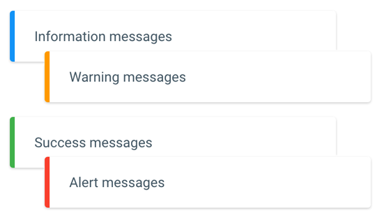
Now with a couple of clicks you can neatly style your content into color coded message blocks like these:

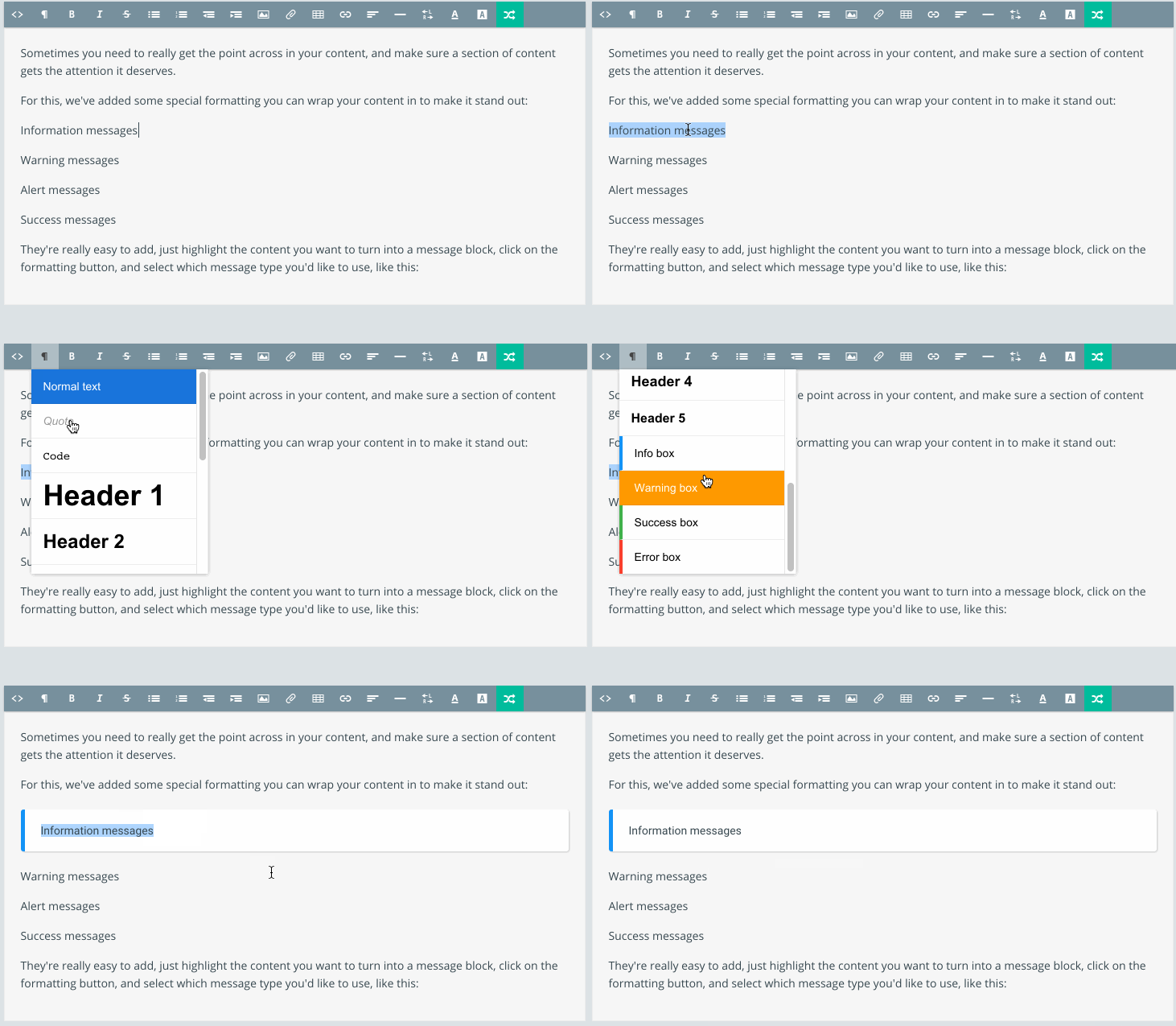
We’ve made it super easy to add these message blocks into your content. In the editor, just highlight the content you want to style, click on the formatting button, then scroll down and select the message block style you’d like to use.
Simple!

To see the end result of the above article all nice and styled, click here.

